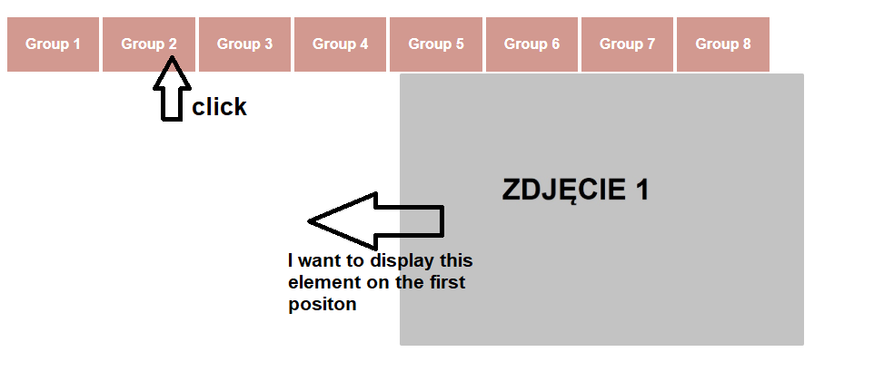
I need your help. When I fillter my image gallery and choose image that is on the second, third … etc position, image is static, doesn’t change position to the first from the left dynamically. ( see screen )
My code:
product_gallery.html
 <!DOCTYPE html>
 <html>
 <head>
    <title></title>
    <link rel="stylesheet" type="text/css" href="style_gallery.css">
    <script src="https://ajax.googleapis.com/ajax/libs/jquery/2.1.3/jquery.min.js"></script>
    <script src="/gallery/js/gallery_button.js"></script>
    <meta name="viewport" content="width=device-width, initial-scale=1">

 </head>
 <div class="logo"><a href="" class="logo_link">Example Page</a></div>
 <body>
<div class="nav_buttons">
  <ul class="tabs">
     <a data-filter=".group-1" href="#" class="group_link">Group 1</a>
     <a data-filter=".group-2" href="#" class="group_link">Group 2</a>
     <a data-filter=".group-3" href="#" class="group_link">Group 3</a>
     <a data-filter=".group-4" href="#" class="group_link">Group 4</a>
     <a data-filter=".group-5" href="#" class="group_link">Group 5</a>
     <a data-filter=".group-6" href="#" class="group_link">Group 6</a>
     <a data-filter=".group-7" href="#" class="group_link">Group 7</a>
     <a data-filter=".group-8" href="#" class="group_link">Group 8</a>
  </ul>
</div>

<div class="thumbnails grid" id="portfolio">

  <a href="#"><img src="gallery/M01.jpg" alt="" class="group-1"></a>
  <a href="#"><img src="gallery/M01.jpg" alt="" class="group-2"></a>
  <a href="#"><img src="gallery/M01.jpg" alt="" class="group-3"></a>
  <a href="#"><img src="gallery/M01.jpg" alt="" class="group-4"></a>
  <a href="#"><img src="gallery/M01.jpg" alt="" class="group-5"></a>
  <a href="#"><img src="gallery/M01.jpg" alt="" class="group-6"></a>
  <a href="#"><img src="gallery/M01.jpg" alt="" class="group-7"></a>
  <a href="#"><img src="gallery/M01.jpg" alt="" class="group-8"></a>
  <a href="#"><img src="gallery/M01.jpg" alt="" class="group-1"></a>
  <a href="#"><img src="gallery/M01.jpg" alt="" class="group-2"></a>
  <a href="#"><img src="gallery/M01.jpg" alt="" class="group-3"></a>
  <a href="#"><img src="gallery/M01.jpg" alt="" class="group-4"></a>

</div>

</body>
</html>
style_gallery.css
@font-face {font-family: "ISOCT3"; src: url("https://db.onlinewebfonts.com/t/6d585d4b2c76dabcf084d51d2e9c87e1.eot"); src: url("https://db.onlinewebfonts.com/t/6d585d4b2c76dabcf084d51d2e9c87e1.eot?#iefix") format("embedded-opentype"), url("https://db.onlinewebfonts.com/t/6d585d4b2c76dabcf084d51d2e9c87e1.woff2") format("woff2"), url("https://db.onlinewebfonts.com/t/6d585d4b2c76dabcf084d51d2e9c87e1.woff") format("woff"), url("https://db.onlinewebfonts.com/t/6d585d4b2c76dabcf084d51d2e9c87e1.ttf") format("truetype"), url("https://db.onlinewebfonts.com/t/6d585d4b2c76dabcf084d51d2e9c87e1.svg#ISOCT3") format("svg"); }

body {

  }

/** RESET **/
* {
  margin: 0;
  padding: 0;
  border: 0;
  outline: 0;
  box-sizing: border-box;
}
html, body {
  height: 100%;
}


/** THUMBNAILS GLOBALS **/
.thumbnails {
  display: flex;
  flex-wrap: wrap;
}
.thumbnails a {
  height: 300px;
  margin: 2px;
  border-radius: 2px;
  overflow: hidden;
}
.thumbnails img {
  height: 100%;
  object-fit: cover;
  transition: transform .3s;
}
.thumbnails a:hover img {
  transform: scale(1.05);
}

/** THUMBNAILS GRID **/
.thumbnails.grid a {
  width: calc(25% - 4px);
}
.thumbnails.grid a.double{
  width: calc(50% - 4px);
}
.thumbnails.grid img {
  width: 100%;
}


/** RESPONSIVENESS **/
@media (max-width: 1500px) {
  .thumbnails.grid a {
    width: calc(33.33% - 4px);
  }
}
@media (max-width: 1000px) {
  .thumbnails.grid a {
    width: calc(50% - 4px);
  }
  .thumbnails.grid a.double{
    width: calc(100% - 4px);
  }
}
@media (max-width: 500px) {
  .thumbnails.grid a {
    width: calc(100% - 4px);
  }
}


.logo {
  font-family: ISOCT3;
  font-size: 38px;
  font-weight: bolder;
  margin:auto;
  padding-top: 28px;
  padding-bottom:20px;
  max-width: 80%;
  color: #b8860b;
  text-align: center;
  letter-spacing: 3px;
}

@media only screen and (max-width: 800px) {

.logo {
  font-family: ISOCT3;
  font-size: 24px;
  font-weight: bolder;
  display: block;
  color: #b8860b;
  padding-top:25px;
  margin: 0px auto 15px auto;
  max-width: 90%;
  height: auto !important;
  letter-spacing: 2px;
}
}

.logo_link {
  color: inherit; /* blue colors for links too */
  text-decoration: inherit; /* no underline */
  -webkit-tap-highlight-color: rgba(0, 0, 0, 0);
}

.group_link {
    background-color: #D29990;
    font-family: "Helvetica Neue", Helvetica, Arial, sans-serif;
    font-weight: bold;
    text-shadow: 0 -1px 1px saturate( darken($pink, 20%), 20%);
    text-decoration: none;
    color: #fff;
    padding: 5px 20px;
    line-height: 50px;
    @include border-radius(50%);
    display: inline-block;
    @include transition( all .2s ease-in-out);

    &:hover {
      background-color: saturate( $pink, 20%);
    }
}

.nav_buttons{
  margin: 0 auto;
   padding-left: 20px;
  }
gallery_button.js
$(document).ready( function () {
  $('.tabs').find('a').click( function (e) {
    var theFilter = $(this).data('filter');

    e.preventDefault();
    $('.tabs').find('a').removeClass('active');
    $(this).addClass('active');

   $('#portfolio').find('img').show(); $('#portfolio').find('img').not(theFilter).hide();

  });
});
And here is the screen showing what’s wrong :
Advertisement
Answer
Your code is pretty close to working, if I remove the grid class (on the thumbnails div) it would produce your desired behavior without any additional modifications, but you most likely want the grid behavior.
Even though you’re hiding the img elements, their parent elements (a anchor elements) are not hidden. You should be able to hide/show the parent elements of the images (the a anchor elements) to get your desired behavior.
As you can see from the modified js below, it’s just one extra .parent() call that was adjusted on your show/hide selectors:
$('#portfolio').find('img').parent().show();
$('#portfolio').find('img').not(theFilter).parent().hide();
Just one additional suggestion for future questions: typically it’s a lot easier for people to answer you question + see what you’re seeing by using the built in Javascript/HTML/CSS snippet tool built into StackOverflow (for images you can use something like the placeholder site I used below).
$(document).ready( function () {
  $('.tabs').find('a').click( function (e) {
    var theFilter = $(this).data('filter');

    e.preventDefault();
    $('.tabs').find('a').removeClass('active');
    $(this).addClass('active');

   $('#portfolio').find('img').parent().show();
   $('#portfolio').find('img').not(theFilter).parent().hide();

  });
});
@font-face {
font-family: "ISOCT3";
src: url("https://db.onlinewebfonts.com/t/6d585d4b2c76dabcf084d51d2e9c87e1.eot");
src: url("https://db.onlinewebfonts.com/t/6d585d4b2c76dabcf084d51d2e9c87e1.eot?#iefix") format("embedded-opentype"), url("https://db.onlinewebfonts.com/t/6d585d4b2c76dabcf084d51d2e9c87e1.woff2") format("woff2"), url("https://db.onlinewebfonts.com/t/6d585d4b2c76dabcf084d51d2e9c87e1.woff") format("woff"), url("https://db.onlinewebfonts.com/t/6d585d4b2c76dabcf084d51d2e9c87e1.ttf") format("truetype"), url("https://db.onlinewebfonts.com/t/6d585d4b2c76dabcf084d51d2e9c87e1.svg#ISOCT3") format("svg");
}
body {}
/** RESET **/
* {
margin: 0;
padding: 0;
border: 0;
outline: 0;
box-sizing: border-box;
}
html,
body {
height: 100%;
}
/** THUMBNAILS GLOBALS **/
.thumbnails {
display: flex;
flex-wrap: wrap;
}
.thumbnails a {
height: 300px;
margin: 2px;
border-radius: 2px;
overflow: hidden;
}
.thumbnails img {
height: 100%;
object-fit: cover;
transition: transform .3s;
}
.thumbnails a:hover img {
transform: scale(1.05);
}
/** THUMBNAILS GRID **/
.thumbnails.grid a {
width: calc(25% - 4px);
}
.thumbnails.grid a.double {
width: calc(50% - 4px);
}
.thumbnails.grid img {
width: 100%;
}
/** RESPONSIVENESS **/
@media (max-width: 1500px) {
.thumbnails.grid a {
width: calc(33.33% - 4px);
}
}
@media (max-width: 1000px) {
.thumbnails.grid a {
width: calc(50% - 4px);
}
.thumbnails.grid a.double {
width: calc(100% - 4px);
}
}
@media (max-width: 500px) {
.thumbnails.grid a {
width: calc(100% - 4px);
}
}
.logo {
font-family: ISOCT3;
font-size: 38px;
font-weight: bolder;
margin: auto;
padding-top: 28px;
padding-bottom: 20px;
max-width: 80%;
color: #b8860b;
text-align: center;
letter-spacing: 3px;
}
@media only screen and (max-width: 800px) {
.logo {
font-family: ISOCT3;
font-size: 24px;
font-weight: bolder;
display: block;
color: #b8860b;
padding-top: 25px;
margin: 0px auto 15px auto;
max-width: 90%;
height: auto !important;
letter-spacing: 2px;
}
}
.logo_link {
color: inherit;
/* blue colors for links too */
text-decoration: inherit;
/* no underline */
-webkit-tap-highlight-color: rgba(0, 0, 0, 0);
}
.group_link {
background-color: #D29990;
font-family: "Helvetica Neue", Helvetica, Arial, sans-serif;
font-weight: bold;
text-shadow: 0 -1px 1px saturate(darken($pink, 20%), 20%);
text-decoration: none;
color: #fff;
padding: 5px 20px;
line-height: 50px;
@include border-radius(50%);
display: inline-block;
@include transition(all .2s ease-in-out);
&:hover {
background-color: saturate($pink, 20%);
}
}
.nav_buttons {
margin: 0 auto;
padding-left: 20px;
} <!DOCTYPE html>
<html>
<head>
<title></title>
<link rel="stylesheet" type="text/css" href="style_gallery.css">
<script src="https://ajax.googleapis.com/ajax/libs/jquery/2.1.3/jquery.min.js"></script>
<meta name="viewport" content="width=device-width, initial-scale=1">
</head>
<div class="logo"><a href="" class="logo_link">Example Page</a></div>
<body>
<div class="nav_buttons">
<ul class="tabs">
<a data-filter=".group-1" href="#" class="group_link">Group 1</a>
<a data-filter=".group-2" href="#" class="group_link">Group 2</a>
<a data-filter=".group-3" href="#" class="group_link">Group 3</a>
<a data-filter=".group-4" href="#" class="group_link">Group 4</a>
<a data-filter=".group-5" href="#" class="group_link">Group 5</a>
<a data-filter=".group-6" href="#" class="group_link">Group 6</a>
<a data-filter=".group-7" href="#" class="group_link">Group 7</a>
<a data-filter=".group-8" href="#" class="group_link">Group 8</a>
</ul>
</div>
<div class="thumbnails grid" id="portfolio">
<a href="#"><img src="https://via.placeholder.com/150" alt="" class="group-1"></a>
<a href="#"><img src="https://via.placeholder.com/150" alt="" class="group-2"></a>
<a href="#"><img src="https://via.placeholder.com/150" alt="" class="group-3"></a>
<a href="#"><img src="https://via.placeholder.com/150" alt="" class="group-4"></a>
<a href="#"><img src="https://via.placeholder.com/150" alt="" class="group-5"></a>
<a href="#"><img src="https://via.placeholder.com/150" alt="" class="group-6"></a>
<a href="#"><img src="https://via.placeholder.com/150" alt="" class="group-7"></a>
<a href="#"><img src="https://via.placeholder.com/150" alt="" class="group-8"></a>
<a href="#"><img src="https://via.placeholder.com/150" alt="" class="group-1"></a>
<a href="#"><img src="https://via.placeholder.com/150" alt="" class="group-2"></a>
<a href="#"><img src="https://via.placeholder.com/150" alt="" class="group-3"></a>
<a href="#"><img src="https://via.placeholder.com/150" alt="" class="group-4"></a>
</div>
</body>
</html>