I’m trying to center my div content responsively with a sidebar menu and a top menu using bootstrap. But my div content is placed at the bottom of my page when I require the side-menu file and I don’t know why. I’m not using any CSS file, just Bootstrap 5.2, but if your solution requires CSS that’s okay.
INDEX
<!DOCTYPE html>
<html lang="pt">
<head>
    <meta charset="UTF-8">
    <meta http-equiv="X-UA-Compatible" content="IE=edge">
    <meta name="viewport" content="width=device-width, initial-scale=1.0">
    <title>TESTE</title>

    <!-- Bootstrap CSS -->
    <link rel="stylesheet" href="<?php echo $base_url . 'assets/css/bootstrap.min.css'; ?>">

    <!-- FontAwesome CSS -->
    <link rel="stylesheet" href="<?php echo $base_url . 'assets/css/all.min.css'; ?>">
</head>
<body>

    <!-- NAVIGATION -->
    <?php require 'application/views/menu/side-menu.php'; ?>


    <div class="container justify-content-center">
        <!-- AGENDAMENTOS -->
        <div class="row mt-5 me-4">
            <div class="col-md-12 offset-md-auto">
                <div class="card">
                    <div class="card-body">
                        <h4 class="text-center"><i class="fa fa-calendar-days"></i> TO DO - 27 </h4>
                    </div>
                </div>
            </div>
        </div>
        <!-- end agendamentos -->


        <!-- FEITOS -->
        <div class="row mt-5">
            <div class="col-md-12 offset-md-auto">
                <div class="card">
                    <div class="card-body">
                        <h4 class="text-center"><i class="fa fa-check"></i> DONE - 27 </h4>
                    </div>
                </div>
            </div>
        </div>
        <!-- end feitos -->
    </div>


    <!-- Bootstrap Bundle JS -->
    <script src="<?php echo $base_url . 'assets/js/bootstrap.bundle.min.js'; ?>"></script>

    <!-- Fontawesome JS -->
    <script src="<?php echo $base_url . 'assets/js/all.min.js'; ?>"></script>
</body>
</html>
SIDE MENU
<div class="d-inline-block">
    <nav class="bg-dark text-white" style="max-height: 100%; height: 100vw; max-width: 10vw;">
        <div class="navbar-default sidebar" role="navigation">
            <div class="sidebar-nav navbar-collapse">
                <ul>
                    <li>a</li>

                    <li>b</li>
                </ul>
            </div>
        </div>
    </nav>
</div>
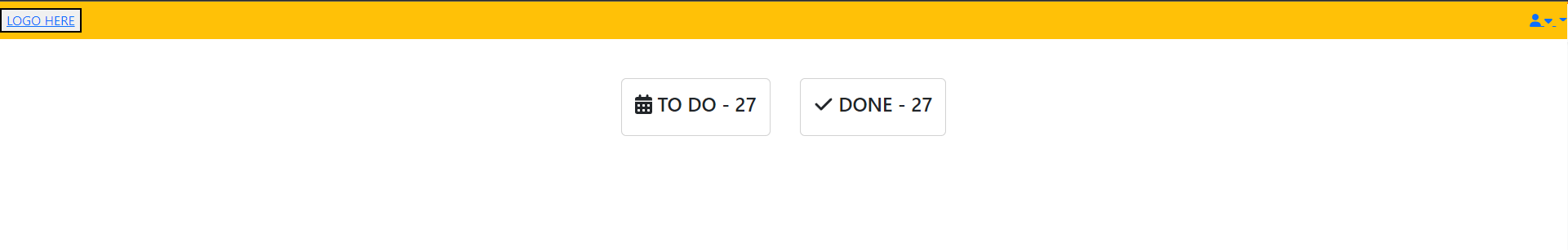
This is what it was supposed to look like, but with the sidebar:
And this is what happens when I require my sidebar file:

I tried using position-absolute and d-inline-block, which resulted on other pages, but this isn’t working on this one
Advertisement
Answer
Bootstrap is build on/with Flexbox. So a good solution for you is to use their Flex Utility classes to make the layout.
Explaining the solution
When dealing with elements that should stretch the entire viewport height it’s good practice to set a min-height of 100vh to html and body.
Note in the CSS I also added min-height: -webkit-fill-available. They are commented out because they don’t work in the iFrame, at least for me they don’t. I recommend removing the comment block if you use this code; they’re useful because Safari (iOS mostly) handles 100vh a little different than the other browsers which can cause some issues.
I then made the body a flex container so its direct children elements (flex items) will stack horizontally (by default). I used the class d-md-flex so all elements will stack vertically below the medium break point. Use d-flex if you want your sidebar to always stick to the left.
If you don’t want body to be flex, a ‘wrapper’ <div class="d-md-flex">...</div> that spans all the (necessary) elements is a good alternative. Just add the CSS for it, setting it to height: 100%; or 100vh.
Speaking of sidebar; making it flex will now make it stretch the whole viewport, since it’s a flex item of a flex container (body) that has a height of 100vh.
And that’s it. Snippet is best viewed using the full page option.
html {
  /*min-height: -webkit-fill-available;*/
}

body {
  height: 100vh;
  /*height: -webkit-fill-available;*/
  max-height: 100vh;
  overflow: auto;
}
<link href="https://cdn.jsdelivr.net/npm/bootstrap@5.3.0-alpha1/dist/css/bootstrap.min.css" rel="stylesheet" integrity="sha384-GLhlTQ8iRABdZLl6O3oVMWSktQOp6b7In1Zl3/Jr59b6EGGoI1aFkw7cmDA6j6gD" crossorigin="anonymous">
<script src="https://cdn.jsdelivr.net/npm/bootstrap@5.3.0-alpha1/dist/js/bootstrap.bundle.min.js" integrity="sha384-w76AqPfDkMBDXo30jS1Sgez6pr3x5MlQ1ZAGC+nuZB+EYdgRZgiwxhTBTkF7CXvN" crossorigin="anonymous"></script>
<link rel="stylesheet" href="https://cdnjs.cloudflare.com/ajax/libs/font-awesome/6.2.1/css/all.min.css" integrity="sha512-MV7K8+y+gLIBoVD59lQIYicR65iaqukzvf/nwasF0nqhPay5w/9lJmVM2hMDcnK1OnMGCdVK+iQrJ7lzPJQd1w==" crossorigin="anonymous" referrerpolicy="no-referrer"
/>
<script src="https://cdnjs.cloudflare.com/ajax/libs/font-awesome/6.2.1/js/all.min.js" integrity="sha512-rpLlll167T5LJHwp0waJCh3ZRf7pO6IT1+LZOhAyP6phAirwchClbTZV3iqL3BMrVxIYRbzGTpli4rfxsCK6Vw==" crossorigin="anonymous" referrerpolicy="no-referrer"></script>
<!DOCTYPE html>
<html lang="pt">
<head></head>
<body class="d-md-flex">
<!-- SIDEBAR -->
<nav class="d-flex flex-row flex-column flex-shrink-0 p-3 text-bg-dark" style="min-width: 10vw;">
hello
</nav>
<!-- END SIDEBAR -->
<!-- MAIN -->
<main class="container">
<div class="row mt-5 row-cols-1 row-cols-md-3 g-4 justify-content-center">
<div class="col">
<div class="card">
<div class="card-body">
<h4 class="text-center"><i class="fa fa-calendar-days"></i> TO DO - 27 </h4>
</div>
</div>
</div>
<div class="col">
<div class="card">
<div class="card-body">
<h4 class="text-center"><i class="fa fa-check"></i> DONE - 27</h4>
</div>
</div>
</div>
</div>
</main>
<!-- END MAIN -->
</body>
</html>Your card layout
I changed your two cards layout to make it easier to control how they behave, using row columns and the gap g-* utility class. It has no effect on how the sidebar behaves, so if it’s of no use; just ignore it.